Saturday, April 9, 2011

Natural Beauty


Photography, to say the least, is not my forte. Though it is something that has always struck an interest with me, and something that I’ve always thoroughly enjoyed,  have never own a “professional” camera, nor taken any professional lessons in using cameras appropriately. This being said, I do believe that this is how most of the world’s famous photographers start. Learning as you go along, you develop a connection with the topic, you gain an understanding of what looks good, and what you want to steer away from.
After borrowing a Canon Rebel SLR camera for a week, I began to understand what I preferred, and what I felt was a beautiful picture. Though my focus was sometimes sidetracked, I quickly realized that what I enjoyed the most was incorporating the sky in my pictures. To me the sky is a beautiful background to any subject, and a completely natural one at that. It has the ability to set the mood for your picture depending on the weather, and I feel like mood is a major component to photography.
One photographer whose work clearly uses the sky as a backdrop would be Alan Aubry. Alan Aubry is a French photographer, who graduated from the Art College of Rouen, France in 1998. I found that most of his architectural photos are often taken at a point of view where the sky is very evident. It allows the subject to pop, and I think it’s a very clever way of using natural beauty to enhance your photos. This is something that I also attempted to do with my own photographs, though the week had given me some rather gloomy weather, I feel like as though it had enhanced the mood of my photos drastically. The photography of the tip of the kissing bridge matched with the dark clouded day, I feel really brought out the old rustic feel of this Guelph landmark, which is something I really wanted to accomplish. Likewise the beautiful blue skies that are displayed in the photograph of the Albion Hotel sign, had really worked hand in hand with the royal blue of the sign, allowing the subject to pop in its own way. Finally my picture of the tree branches sitting against the blue sky is a great display of how this natural background helps enhance a photograph.
Another wonderful photographer that uses the beauty of nature as his main focus is Ansel Adams. Ansel Adams was a photographer and environmentalist who was born in San Francisco, California. After viewing some of his photographs it was clear to me that he too enjoyed using the natural beauty of nature’s ways. I feel like my picture of the tipped over canoe is a good depiction of allowing the natural beauty of nature to shine through in photography. This was a canoe that I had found which had been out all winter stuck at the shore of Speed River in Guelph. The harsh winter had down some beautiful damage to the canoe and I feel like my photograph had captures it quite wonderfully. Another one of my pictures which displays the doorway of an older house in Guelph, shows again the wear and tear of weather and time.
It’s beautiful to see what nature is capable of, even in its smallest forms. It has the ability to work as a backdrop to our photographs, or help display the age of an object. Nature is there for us to enjoy and explore through photographs, and that is something that I had learned through taking these photographs. Gaining a new appreciation for how beautiful the world really is.

Tuesday, March 22, 2011

Press Photography/Art Photography


Press photography versus art photography, I find this almost difficult to even consider comparing, although press photography still does technically continue to grasp a certain emotion from the viewer, I find that press photography is basically just visual news. A photograph to support the news that its paired with. What the human eye does not see, the human tends to not believe. So if I were to talk about the recent Tsunami in Japan, someone may find it very difficult to believe the absolute destruction that occured. But with the help of press photography they are able to see what I'm talking about. Press photography is there for us to become educated in current world issues, they help us understand current situations. It was there for us when the 9/11 happened, when the war in Iraq began, when natural disasters attack. But not all press photography is necessarily negative, the press also lets us see the positive, the triumphs of man. When Barrack Obama was elected president of the United States of America, press photography let us all capture that moment and hold on to it for the rest of our lives. Moment such as when Canada set the record for most gold Olympic gold medals, in the Vancouver 2010 Winter Games, a victory for all Canadians to celebrate and commemorate. Press photography has little boundaries; it’s there for the good, the bad and the ugly, but without it we’re all hidden away in our little shells clueless to what the rest of the world is going through.
On the other side of the spectrum is art photography. This can pin point current world issues, but more times is expressed through the emotions of the photographer, or an attempt to grasp the viewer’s emotions. It’s made for the viewer’s pleasure, bending reality to create a new beauty and capturing that photograph. Art photography is exactly that a medium of expression for the artist behind the lens, I have chosen to use my friend Jamie Campbells photography to display this for you, in two different series’ of his, where he explores these almost fantasy worlds. First let’s look at this piece from Beasts Of Burden. Where Jamie told me “This series investigates the physical representation of burden, and the intangible weight individuals seem to unnecessarily endure. It deals with melodrama and solidarity, and how those two things combined can escalate into a seemingly unmanageable situation. 
     The images deal with a kind of overwhelm, but a ridiculous kind of overwhelm – where as an audience you don’t know if you are supposed to feel sorry for the subjects, or laugh at there pathetic state.
 Jamie used the heads of mascots and put them on regular humans, in ordinary situations. I’ve chosen a rather clever piece from this series entitled Dolphin Girl. Which sees a girl with a dolphin head on, sitting by the bathtub; it’s a rather clever photograph and really display the freedom of art photography. The second piece is from his series titled Only The Fantastic Has Some Chance Of Being True. When I asked Jamie to describe to me his approach in this series he told me “While sifting through various supernatural accounts from the book ‘U.F.O.s and Extra Terrestrials in History’ (Vol. 1-4 , Yves Naud, 1978), I began to notice a direct link from the descriptors in the stories to a distinct photographic language. In describing separate accounts of supernatural phenomena, the camera’s flash was repeatedly mentioned. Quotes such as, ‘I was dazzled by a sort of brilliantly white shining light like a magnesium flash’ automatically influenced my interpretation of the incident. The stories often depicted unexplainable light sources, which ultimately led the character to their unfathomable experience. The constant references to the flash, or burst of light seemed easily explainable from a photographic perspective.
      By loosely incorporating small sections of the supernatural accounts, I have restaged and recreated incidents of the past. Influenced by the descriptive quality of the light within the stories, I have tried to emphasize and match the majestic and unexplainable power that could only be documented, at the time, through words.
 In this series Jamie used artificial smoke, light and even an extra body to create these almost eerie scenes which are more often seen in fantasy stories. The photograph I’ve chosen to display from this series sees an almost limp man being helped by a shadowy character towards the fluorescent light of the window. To me it’s a perfect play on the saying “going towards the light” when one is talking about death. Which I think is perfectly evident by the limp body being helped by a dark shadowy character (who reams a haunting resemblance to the grim reaper). Jamie is truly a clever and fresh photographer, and has made his art photography truly enjoyable for the viewer.
It’s easy to say in conclusion that although press photography more often than not is there for us to gain an understanding of current world issues, and art photography is created in order to please the viewer’s eye. They both have one thing in common, and that is the ability to create an emotion. Looking at the disastrous outcome of the recent tsunami in Japan we experience emotions such as shock, sadness and disarray. And when looking at the art photography of Jamie Campbell we gain a sense of happiness and enjoyment due to how clever he is with his photographs
Sources: 


Saturday, February 12, 2011

Let's Make A Change


I decided to take some of my older photos, one of which I posted last week and try to revamp them. The camera that I used has a bit of wear and tear, and had been sitting on my brothers’ shelf for a while. I’m not a photographer, nor have I ever pretended to be, so it was very exciting for me to run around Montreal with a camera and try it out. It’s a film camera, which definitely didn’t help with getting clear pictures back when I had them developed.
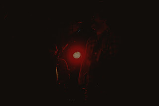
With that being said this first picture was one I took at a concert I was playing in. I decided to try and use Picasa, which is one of the free editing software’s recommended for this particular photograph. I didn’t want to skew the image by any means, as I believe with the shutter speed I used at the time I had enough going on in the picture already. I really enjoy how you’re able to see the way the bassist was moving (grooving) to the music. So my main goal was just to get rid of as much grain as I could so that the eyes wouldn’t be distracted from the main focus of the photograph. I first used a “Basic Fixes” button which was entitled I Feel Lucky, it’s described as being a “one-click fix for lighting and colour”. But even with that I still found that there was too much grain in the picture. I followed by increasing the Shadow on the tuning tab to roughly fifty percent which darkened the whole picture. I then used the Graduated Tint effect and brought the brightness down, while keeping that vibrant red of the musician. I really enjoy the outcome of this editing as I feel it’s given me a more clear and moody photograph.
If you notice due to the camera’s age and/or film the original pictures tend to have a line cross through them near the top of each photograph. One major goal was for me to eliminate that line without having to take away too much from the overall feel of the picture. I opted to use a different editing program for the second photograph, and ended up using Picnik. This second photograph already had a certain dark tone to it, a very intimate picture I took during the show, so I really wanted to enhance that intimate feeling, by first turning down the exposure. I then increased the contrast slightly to solidify the photo, to relax the aggressive red light that was shining in between the two musicians; I tended to the colours tab and decreased the saturation while increasing the temperature. I also changed the neutral picker colour from gray to the red that was sampled from the light; by doing this when I increased the temperature, the entire hue of the photograph went red, which I think really adds to the picture. I find that the end product is really beautiful, it creates a great intimacy within the picture, by taking away some of the minor details that were originally scattered through the photograph. I feel that we’ve accomplished a beauty that was really lacking before I decided to edit this photo. 

Sunday, January 30, 2011

Thank You Montreal!


I played a show a few years ago now, and here are some pictures I took to remember the night!

Mass Production

     At one point art collectors were able to truly conquer all by having one of a kind pieces of art all to themselves, museums took turns with these pieces displaying them all over the world, allowing all of us to experience the beauty, but soon enough the art of prints came into action. Now everyone could hang the Mona Lisa in their house, if course it was a dumbed down version, done on either a matte or glossy finish poster, but with a nice frame, you now had yourself a piece of art hanging on your wall, right?

     I feel as if some of these classic pieces that have been reproduced and/or re-released definitely lose their original aesthetic. No longer do you get to feel the art, but you merely have it take up some wall space in your living room. There's absolutely nothing beautiful about a poster of the Mona Lisa, no whimsical feeling to pair up with Van Gogh's The Starry Night.

     Another issue that has come up n the present day is the mass production of "art". Stores like Urban Outfitters, who's artsy furniture, and apartment accessories are sold by the thousands to hipsters everyday, in an attempt to make their small studio apartments "unique". This is a great attempt at making yourself seem artsy, but the fact of the matter is there are over 1000 other people in the same city as you that have that exact same picture hanging over their bed. So is Urban Outfitters really selling us art? I would say no they're selling us junk to portray a lifestyle that we like to display. Does this make us horrible people? Absolutely not, if we deprived of all things reproduced, then none of us would have anything on our walls, we'd live a bare, bare world, that would be rather depressing. So I say go out and buy that print hang it high and hang it with pride!

Monday, January 24, 2011

Early Portraits vs. Modern Day Portraits


                             (Top:Andrew Jackson photographed by Mathew Brady in 1845  Bottom: George Clooney, Martin Schoeller, Close Up: Portraits (1998-2005)

           The main objective in any portrait past or present is to capture that moment in someone’s life. In most cases a portrait was taken in a moment of succession, a point of pride in one person’s life, a family’s time spent together as a whole. Being able to capture that beautiful moment in time, and to cherish that and conceal it so it can be represented as almost a time capsule is truly beautiful. And though the idea of a portrait continues to develop, it can also be destroyed in the modern day.
Photographers such as Martin Schoeller who have created an art in creating portraits, can still acknowledge the beauty that the portrait once conveyed. With his work Close Up: Portraits (1998-2005), Martin Schoeller took stripped down, hyper-close portraits of both world renown celebrities and everyday people. These photographs take an in-depth look at the human face, nothing is hidden, the wrinkles, the laugh line, the scars are all put on display accentuating the face and displaying it in a completely new fashion. Though Martin Schoeller’s work does not end there his photographs grace the pages of some of North America’s most popular magazines (The New Yorker, Outside Magazine, Entertainment Weekly, Rolling Stone, GQ, Esquire, and Vogue). Both his stripped down portraits and those of which include backgrounds and props are truly remarkable, and display a true understanding of the modern day portrait.
Where the modern day portrait tends to lose its lustre is when social networks come into play. As much denial as there is, the “display pictures” are also portraits. They’re moments caught and digitally saved into the modern world, displayed for everyone. This is for the most part where portraits have steered in a new direction in comparison to the early day portrait. What was once a display of success and pride now becomes a bad recollection of the night before. And though for some, the core meaning of the portrait holds true, in capturing a moment in your life that can now be looked back at for years to come, it seems in the modern day we’re all photographers attempting to capture our best sides.

Monday, January 17, 2011

Welcome

Hello my name is Bryan Richards. I was born and raised in Montreal, and I'll take that to the grave, I love the city to death. Here's a picture I took called "Flashing Lights"